StealthTest
Web3 dApp for secure smart contract testing
Role
product designer
timeline
jun ‘22 - dec ‘23
Team
vp of product,
product manager,
10-15 engineers
StealthTest aimed to fill a gap in the web3 developer app market. Not only were we aiming to provide secure testing, but also produced a dev tool to test and launch blockchain projects. The mission was simple: Enhance smart contract testing capabilities and foster genuine security in this ever-growing industry.

TL;DR
(too long; didn’t read)
The problem
Web3 developers need a way to test smart contracts securely without possibility of leaking data so that blockchain projects (i.e. generative art nfts) could launch confidently knowing that proprietary data has not been sniped or exposed.
Addressing the pervasive FUD (Fear, Uncertainty, Doubt) in Web3, StealthTest aimed to be the beacon of security for artists and creators venturing into or building blockchain/NFT projects. With the absence of private testnets (test networks), it aimed to safeguard projects from leaking private data and information by creating a safe haven for Web3 developers to test thoroughly and launch confidently.
Solution
An end-to-end dApp (developer app) to test and ship web3 projects.
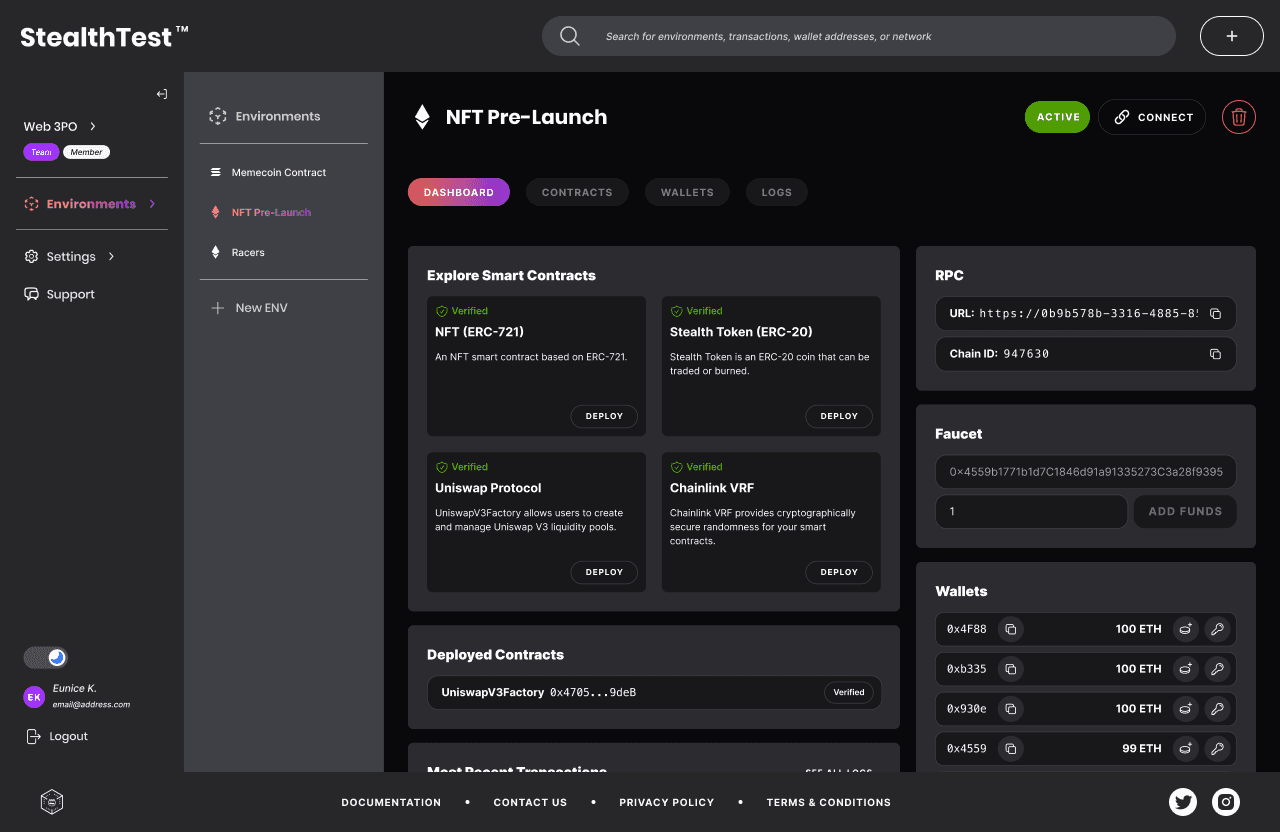
StealthTest initially aimed to be a reliable hub for devs to spin up and create private environments (networks) with a faucet to fund crypto wallets with unlimited test tokens.
In just over one year and 4x feature growth in Q2 2023, StealthTest evolved to an end-to-end web dApp to test and ship (launch) web3 projects.
V2 Design
V1 Design

How it started
Shoot first, aim later
When I joined StealthTest, the visual branding was in place, the backend code was in testing, and the app’s UI was at its skeleton state.
With series funding rounds in tow, the need for the MVP was pivotal to the success of the product and company. I worked closely with the product and engineering team and the motto we thrived by was, “Shoot first, aim later”.


What’s growth without growing pains?
This project had many exciting challenges that ultimately improved the product. The engineering and product team overcame each hurdle and shipped out new features at an exponential rate. Just in Q3 of 2023, the product had 10 new features!
To encapsulate everything my role entailed for this project, I’ve broken it down into a roadmap to demonstrate the end-to-end process and what a journey of adaptation it’s been.
Getting to the MVP
beta launch
Learn as you go
Being familiar with the crypto space was one thing, but learning about developer tools for blockchain was beyond what I’ve ever known. This was a learn-as-you-go moment, as I am not an engineer nor a person who fully understood the complexity of web3 technology. Although initially intimidating, I welcomed the opportunity to learn about web3 networks and testing. I asked loads of questions on 1:1s with the VP of Product, reading the documentation, working closely with the engineers, figjamming live to get real-time feedback from the devs to better understand the product’s code and functionality.
The process
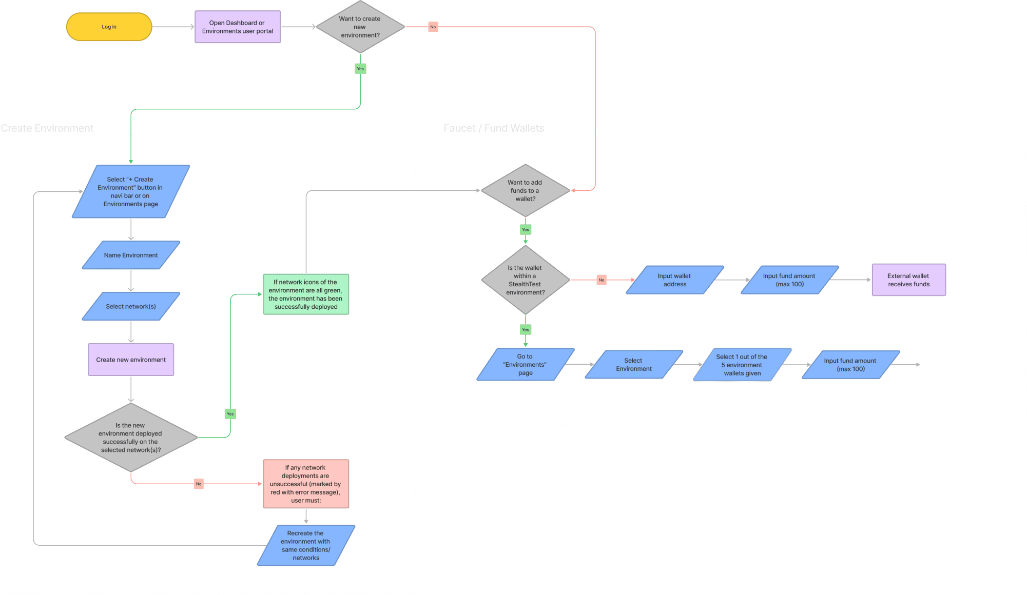
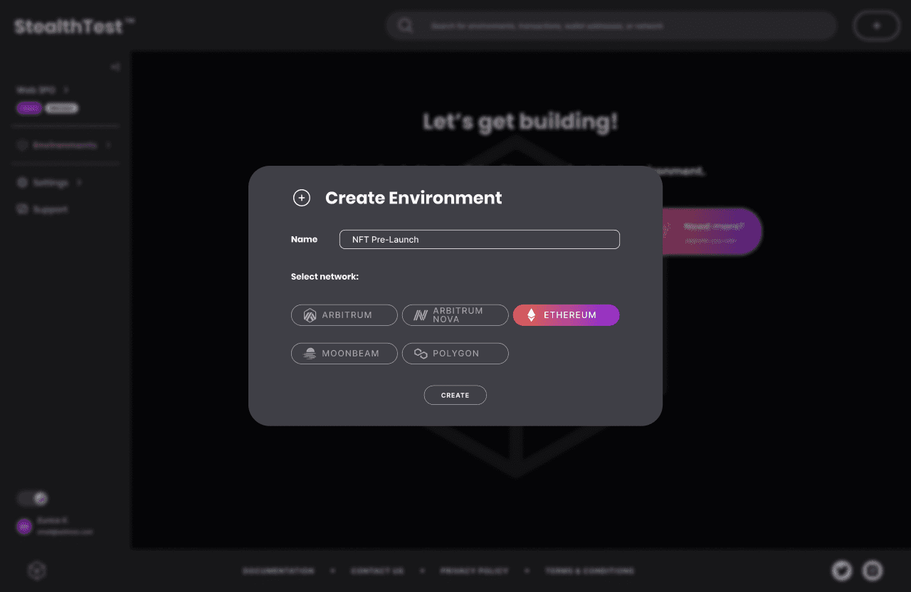
The first end of “End-to-End” product design process started off with two key features of the app: “Create Environment” and “Faucet”. The latter was a unique feature that was not readily available in current market offerings and was a vital feature beta waitlist users were eager to utilize.
Low-fi wireframe

User flow chart 1.0
High-fi wireframe

Design decisions I
In addition to the brand theme set by previous creative director, I utilized shapes to the branding to represent elements of blockchain:
blockchain nodes
smart contract confirmations
web3 interconnectedness
As I collaborated with the devs on user flow and functionality, there were key moments when I advocated for certain design decisions and proven its efficiency to stakeholders with results.
T.M.I.
Leadership wanted to collect as much info as possible during sign up (i.e. Country of Residence, Organization Name, Occupation).
the 2-step
Advocated for a simplified user sign up flow with minimal info collection, which increased sign up completion by 70%.
pay now
Stakeholders wanted subscription plan selection and payment info in order to start free trial.
Pay later
Getting users to utilize the product was the main goal and needed to be prioritized over locking in paying users. To mitigate this, key features were published with limitations on free accounts to incentivize users to subscribe to a plan.


Superfluous steps created a massive friction point that hindered users from trying the product for free, which was the goal for this phase of the product lifecycle.

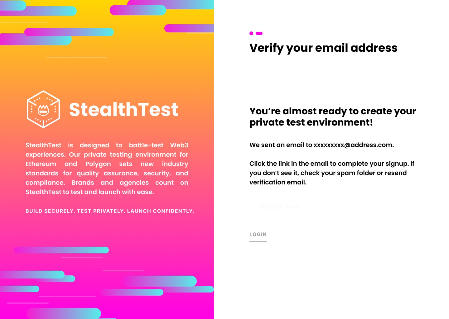
Simplified sign up process into 2 steps, which resulted in a 3x increase in sign up completion and email verification.
The first shot was shot,
and now we aim
Beta launch aka “mvp” aka “v1”
Remember when I mentioned earlier, “Shoot first, aim later”?
The first shot was shot with the release of our Beta, but the work was just getting started as the Product Team, the engineers, and I were getting ready to aim the product to become an end-to-end solution for Web3 projects.


Aim, test, fire!
As more features were added along this journey, the team and I got to adding complexity to what StealthTest can solve for devs building and testing smart contracts. In the next iteration we added:
Team Accounts
multi-tiered subscription plans
Block explorer
transaction logs
updated faucet + wallets
combined redundant features
The chefs were cooking in the back, but some of the dishes never got served. The engineering and product team worked together in bi-monthly Scrum Poker sessions to summarize the recent Sprint and prioritized new vs backlog initiatives. Some noteworthy features that were not prioritized were:
arweave
testnet upload, preview & storage
web sockets
instant feedback (eth only)
chain bridge
bridging data between different networks
Target acquired
team collaboration
Appealing to enterprise
During this growth stage, the product was evolving to a secure platform for teams to test smart contracts. Along with the growth came pressure from stakeholders to grow subscription numbers. This prioritized initiative came with a challenge. Creating multi-user accounts seemed simple enough, but the third-party account management software had limitations which couldn’t be bypassed, so the workaround was creating 2 separate classes of account types: Personal and Team / Multi-user.

I admit, this was a less-than-ideal flow. The addition of an entirely new class for account types was a confusing pain point. However, after discussing with the engineers and understanding the limitations with Recurly, creating these separate account classes was the interim solution.

V1.5
aiming closer to the bullseye
With the new subscription options, users need a way to switch and access multiple accounts and projects. So I pitched adding account switch dropdown in the navigation bar to the product and engineering team. This ended up being a great choice as this was one of the most-used component within the app. This data supported our decision to pivot and iterate onto V2.

V2
the revamp
How to win friends & influence stakeholders
With the varying Personal and Team account types, I saw a need to shift into a side-drawer navigation style so users can access different projects in 2-clicks. In order to do this, I needed to convince the product team, the engineers, and leadership that implementing the next iteration aka “V2” needed to be prioritized.
With plans to increase features by 4x, we needed to revamp our navigation so users can access these new features with frictionless flow. The new features we needed to accommodate were:


Design decisions II
environment-centric
• At the core of each feature is the environment, so we focused features within the environment with submenu pill navigation.
• Improved efficiency and access to environment-specific features
side-drawer navigation
• Multi-level features that are nested
• Switch between projects and accounts in 2-clicks
Theme color
• Updated the color scheme to pass WCAG standards with muted versions of the original brand colors.
• Utilized muted versions of original theme colors to maintain brand consistency.
• Got rid of the faux pas of UI design: #000000 and #FFFFFF
Simplify everything
• Identified components with the most and least interactions, and simplified features to minimal clicks
• Combined wallet and faucet page
• Everything the user needs is in the Environment dashboard
Test it & Ship it
After excessive testing, the initial internal feedback was great and testers were reporting that the new sidebar navigation was intuitive to use. So we were ready to ship it and officially launch V2.

Final thoughts

StealthTest was acquired by Hashlock
product acquisition
StealthTest was acquired by Hashlock, a blockchain security and smart contract auditing firm based in Australia. Read Global Fintech Series' article about the acquisiton.

Teamwork makes the dream work
the dream team
Despite the company’s remote WFH (work from home) structure, the product and engineering team worked together like a well-oiled machine. From sprint pokers to daily stand up meetings, the team communicated problems immediately which led to efficient solutions. I am so grateful for my wonderful colleagues at StealthTest for being a part of this dream team.

What I learned: Ego death
There was an instance when the Lead Developer expressed his critique while we were reviewing redundant features:
“Why do we need to select an environment every time?
This doesn’t make sense.”
The team was focused on shooting that first shot and getting a working product out to satisfy stakeholders and investors, that we had tunnel vision on the features and neglected the core of the product, which were environments.
What at first seemed like harsh feedback, I learned was valuable input that inspired iteration. What he said shifted my existing ideas of the product and ego death occurred. I took myself out of the product completely and saw it with a new perspective. Without these ego death moments during a product’s lifecycle, innovation cannot occur.